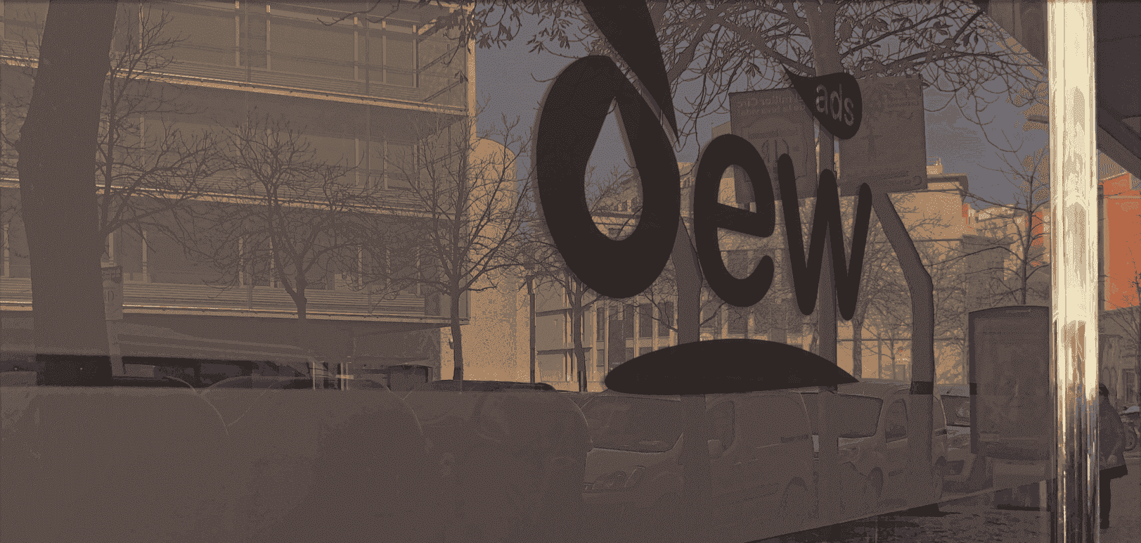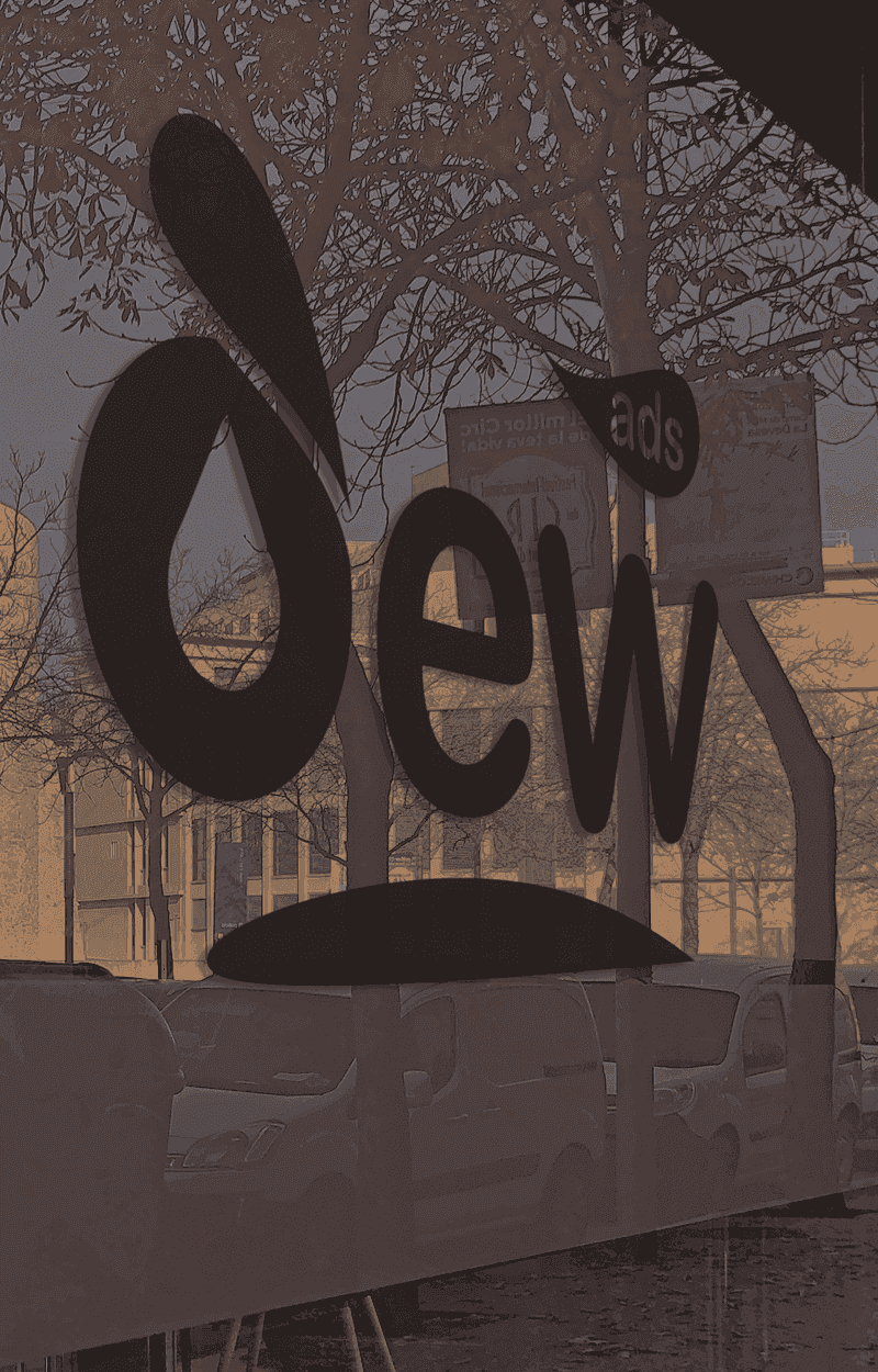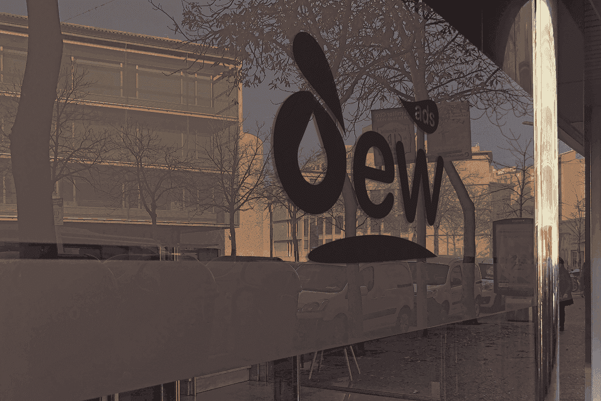
DEW Marketing
I translated the dew metaphor into a minimalist and powerful visual identity: DEW revitalizes businesses just as dew revitalizes the earth at dawn.
The challenge
Creating a visual identity for a marketing agency whose name — DEW (dew) — carried a poetic metaphor: something that appears silently at dawn, revitalizes what it touches, and makes it grow. Translating that into concrete forms without betraying the concept's subtlety.
The solution
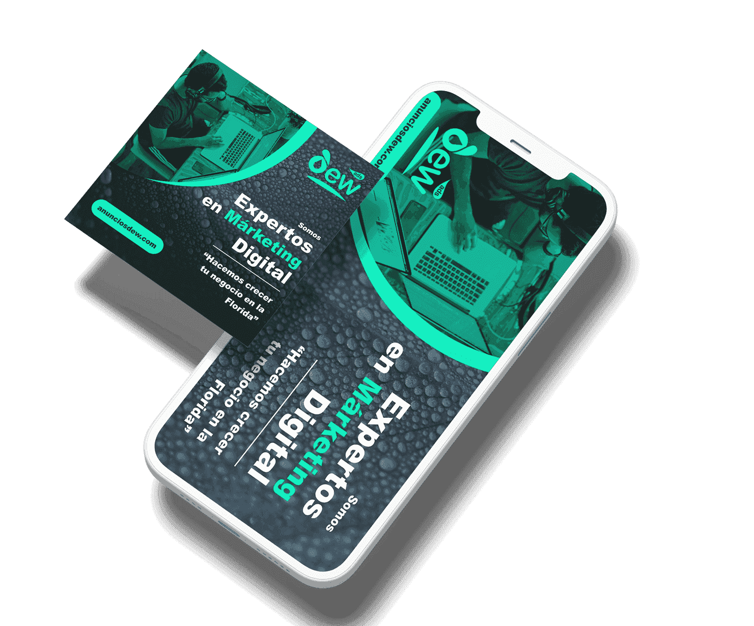
I designed the logo in three system variants (color, positive, negative) for all usage contexts — from white background to dark applications. The system extended to flyers in three formats (landscape, square, and vertical) for digital campaigns, maintaining the minimalist elegance the concept demanded.
The result
An identity that communicates the agency's value proposition with precision: sophisticated, discreet, and effective — exactly like dew.
Project gallery