El Redentor
I modernized the digital image of a Hispanic medical clinic with the tagline "In healing hands" — visual identity, social media covers, and content that conveys medical trust without losing human warmth.
The challenge
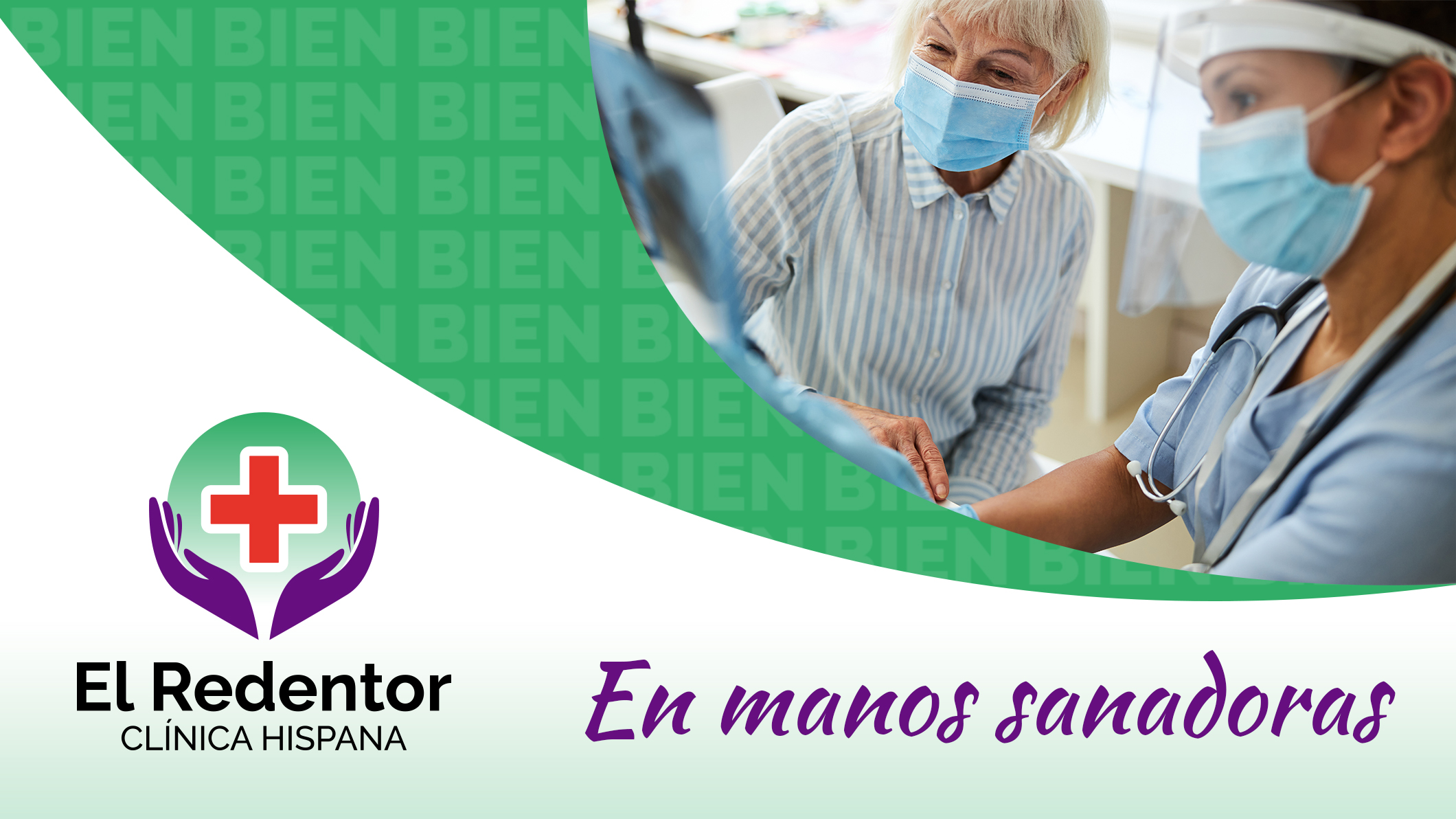
A medical clinic for the Hispanic community needed to renew its digital presence with an identity that overcame the healthcare sector dilemma: cold feels professional but distant, warm feels approachable but less credible. "In healing hands" had to be both at once.
The solution
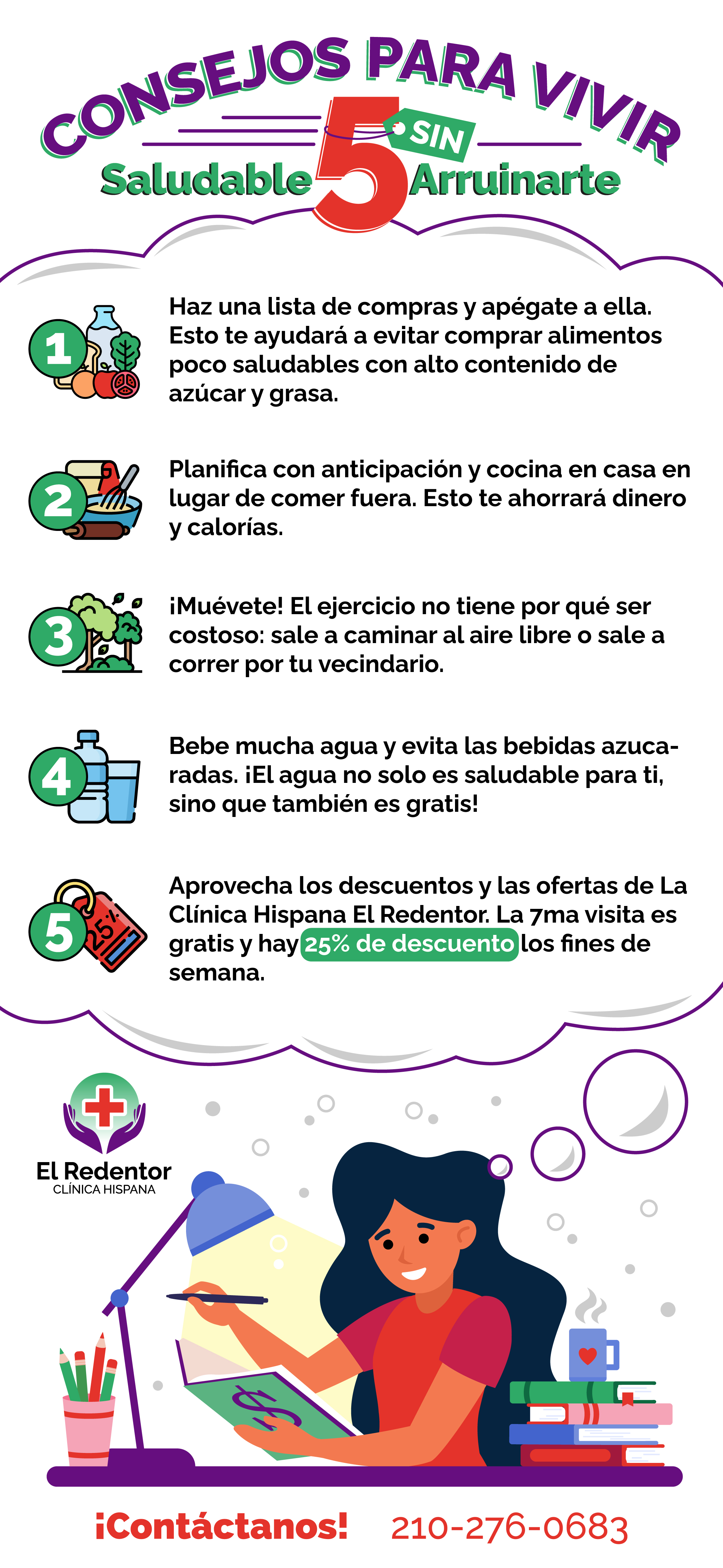
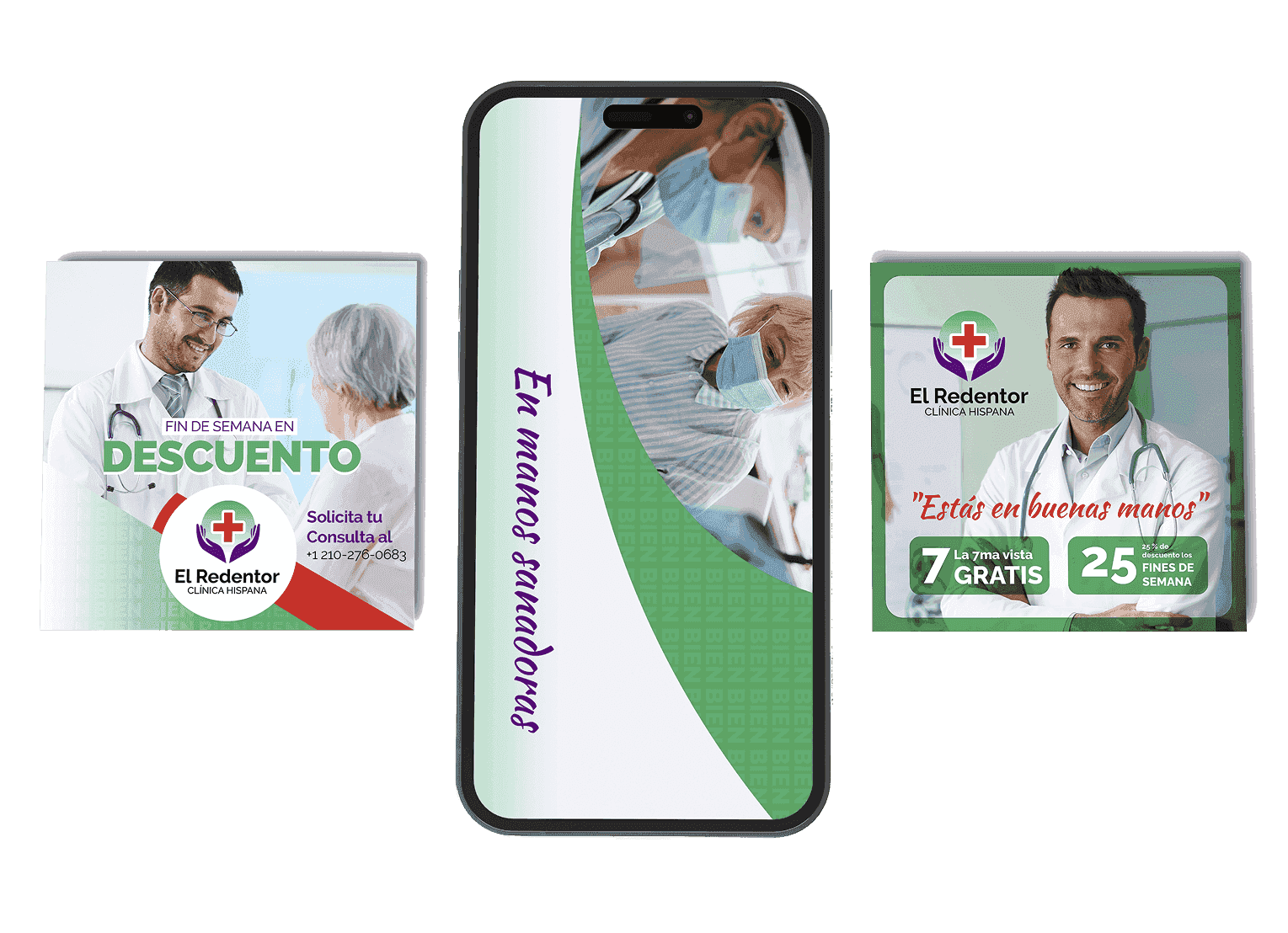
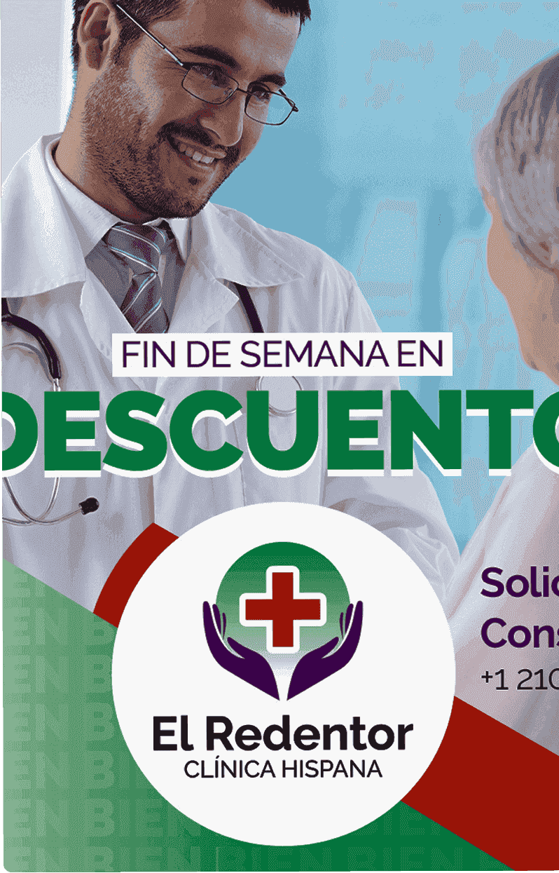
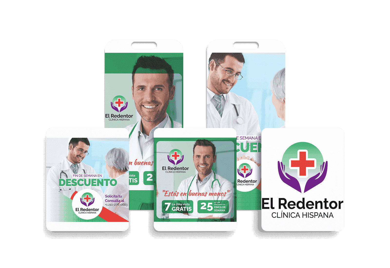
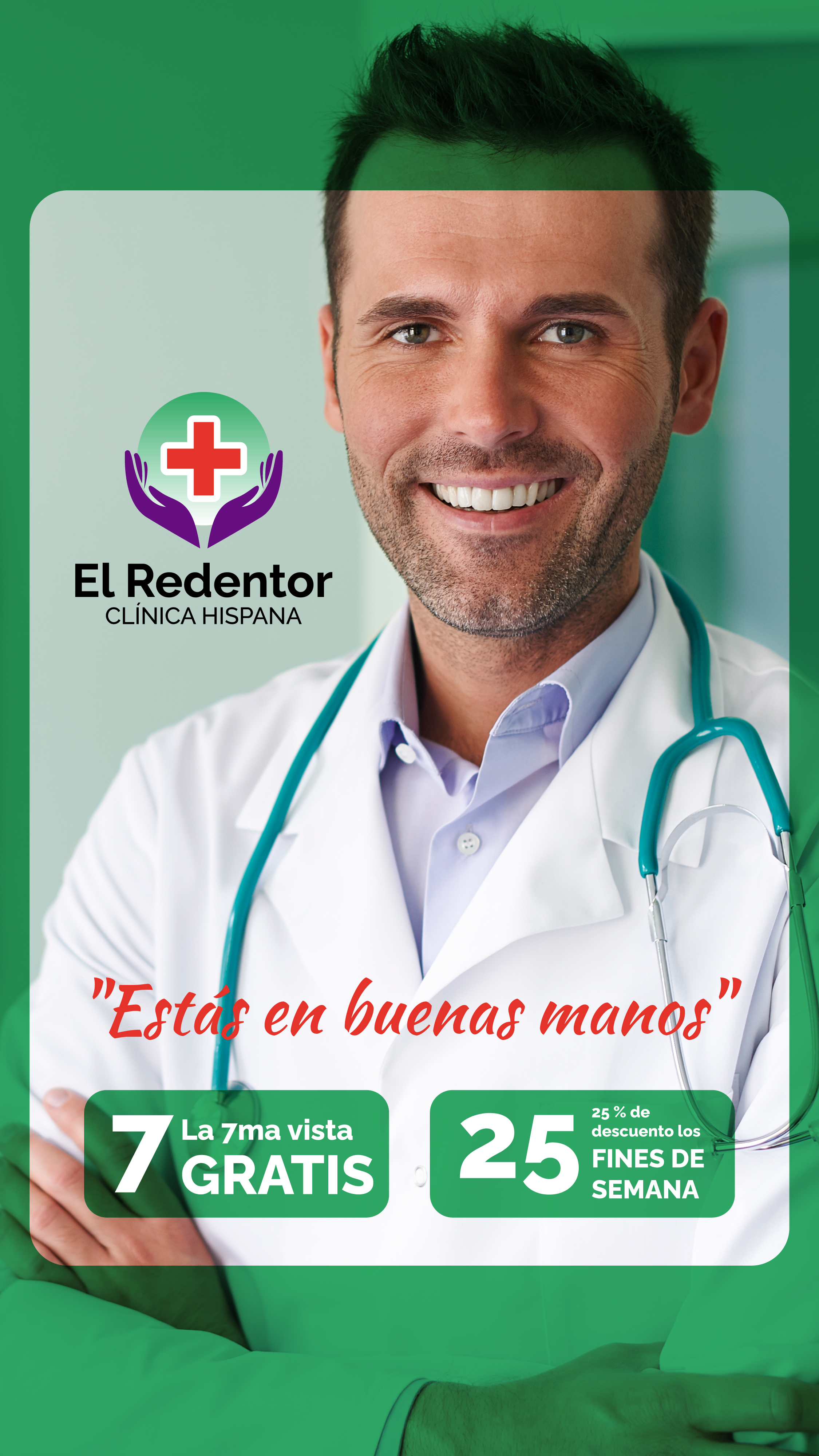
I developed the color identity (clinical green + white + purple) with the typographic "BIEN" (WELL) pattern repeated as background — a declaration of the clinic's intent. Facebook and Google My Business covers, 1×1 posts and stories, weekend discount pieces, and medical infographic, all with visual coherence and warm-professional tone.
The result
A digital presence that the Hispanic community recognizes as close and at the same time trusts as a serious clinic, reflected in the tagline that sums it all up: "In healing hands."
Project gallery

-png.png)

.jpg)
.jpg)