Smart Power Electric
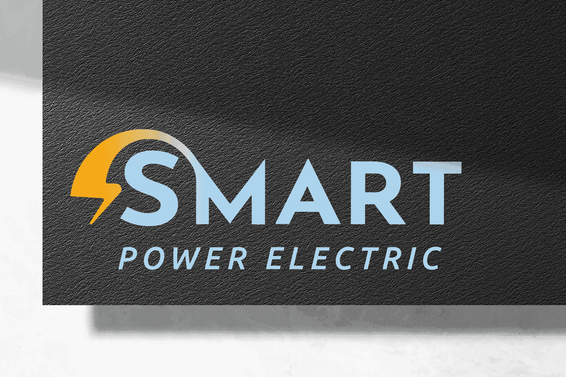
I renewed Smart Power Electric's image with a logo that turns the lightning bolt into the "S" of SMART — and a website that communicates technical expertise with clarity.
The challenge
An electrical company in the USA needed to renew its identity and digital presence to compete with established companies, with a logo that would be recognizable, technical, and memorable without being generic.
The solution
I designed a logo where the lightning bolt is integrated as the letter "S" of SMART — the business symbol becomes the brand initial, with no additional illustrations. Navy + orange/amber palette, MODERN style. Website with Home and Services pages, fully responsive, communicating experience and clarity in electrical installations.
The result
An identity that does exactly what a good logo should: when you see it, you already know what they do — without reading a single word.